
The Aqueduct Water Risk Atlas uses data such as withdrawal levels, total irrigated agricultural areas, renewable water supply, and gridded population to create a highly detailed, localized map of stress factors impacting water resources around the globe. Governments, individuals, and companies use this information to understand emerging water risks and opportunities globally.
The infographic combines these indexes to show hotspots for the next year. Each of the 10 identified hotspots are assigned a water and conflict risk level, with different shades of blue and orange representing degrees of water and conflict risk, respectively. The infographic then elaborates on the specific issues affecting each hotspot.
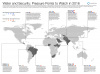
A Global Tour
A country does not need to have both a high water and conflict risk level to be considered a hotspot. Nigeria has a water risk level of two and conflict risk level of nine, yet is identified as a vulnerable area due to a combination of resource-based conflict, terrorism by Boko Haram, and a rapidly growing population that is increasingly subject to displacement by natural disaster and violence.
Brazil’s water risk level of one and conflict risk level of seven, paired with the fact that the country’s water infrastructure requires massive levels of investment that its failing economy cannot provide, makes it a hotspot. São Paulo, Brazil’s largest city, came within five months of running out of water last year.
Ethiopia, South Sudan, and Somalia made the list as well. Famine, insecurity, drought, and early warning system predictions contributed to the identification of these three countries as potential risk areas. Ethiopia is expected to face serious food emergency issues and increased humanitarian needs, following several seasons of below-normal rainfall and debilitating drought.
Water risk (three) and conflict risk (zero) are both low in South Africa, but overburdened infrastructure and civil unrest caused by unemployment and ineffective governance make it place to watch. Droughts, heatwaves, and energy and water shortages are further exacerbating this unrest. The potential for civil unrest also landed Saudi Arabia on the map with its scarce water resources, rising food prices, and a vulnerable oil-based economy.
The infographic identifies Pakistan and India as hotspots mainly due to geopolitical factors. Pakistan is increasingly strained by dwindling water resources and loss of the disputed Kashmir region could lead to full control of Indus River headwaters by India. Pakistan and India’s water risks remain low, at four and three respectively, yet their conflict risks are high considering the potential for decades-old tensions to affect Pakistan’s supply. Geopolitical tensions and conflict also contribute to poor water infrastructure and depleting resources in Gaza, Afghanistan, Tajikistan, and Uzbekistan.
The Syrian refugee crisis has severely stressed the resources and governance capacity of Lebanon and Jordan, resulting in a water risk of three and a conflict risk of six for both countries. As the Jordanian government struggles to deal with depleted aquifers, Lebanese refugee camps are increasingly threatened by waterborne diseases.
The map also takes into account regional issues that affect risk levels in individual countries, such as Honduras, Guatemala, and El Salvador. This area of Central American is identified as a hotspot following a debilitating drought in 2015, chronic violence, lack of economic opportunities, and tension surrounding mineral resources and subsequent water pollution.
The map does a great job of illustrating how a variety of factors, across several continents and at multiple levels, create the potential for water-related crises – and how unique these factors can be.
Download the infographic here.
Sources: Circle of Blue, European Commission Joint Research Center, Humanosphere, Mercy Corps, USAID, World Resources Institute.
Image Credit: Used with permission courtesy of Kaye LaFond/Circle of Blue.


